
Find Your Voice: A Friendly Guide to Basic Calligraphy

Calligraphy, the art of beautiful writing, has captivated people for centuries. Once the domain of scribes and illuminated manuscript creators, it’s now a wonderfully accessible hobby for anyone seeking a creative outlet. This guide will gently introduce you to the fundamentals of calligraphy, helping you find your voice within this elegant art form. We’ll cover tools, techniques, practice exercises, and resources to get you started. Don’t be intimidated! Calligraphy is a journey, not a race, and the most important ingredient is patience and a willingness to experiment.
What *is* Calligraphy?
Often confused with lettering, calligraphy is distinct. Lettering involves drawing letters – constructing them shape by shape. Calligraphy, on the other hand, focuses on the art of writing letters with a single stroke. The thickness and shape of the lines are created by varying the pressure applied to the pen. This variation is key to the beautiful contrast and flow that defines calligraphy. Think of it as dancing with your pen across the page!
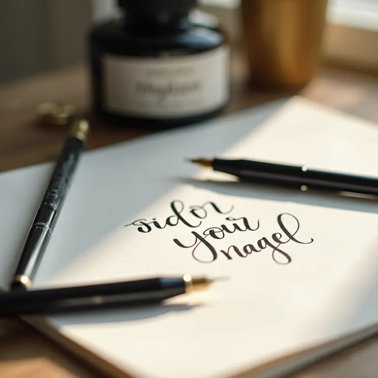
Gathering Your Tools: The Calligrapher’s Kit
You don’t need a massive investment to begin. Here’s a breakdown of essential tools:
- Pens: This is where the magic happens. For beginners, dip pens with interchangeable nibs are excellent. Speedball nibs (like the C-series) are a great starting point – versatile and relatively forgiving. Brush pens are also popular, particularly for modern calligraphy, and offer a more convenient, no-ink-dipping experience. Tombow Dual Brush Pens and Pentel Fude Touch Sign Pens are frequently recommended.
- Ink: Calligraphy ink is different from fountain pen ink. It’s generally thicker and designed for the viscosity needed by dip pens. Sumi ink is a popular choice, known for its rich black color. Walnut ink offers a warmer brown tone. Experiment to find what you like!
- Paper: Not all paper is created equal! Regular copy paper will bleed and feather, ruining your practice. Look for smooth paper specifically designed for calligraphy – Rhodia pads, Clairfontaine Triomphe, and HP Premium 32lb paper are all good options.
- Straight Pen Holder: For dip pens, you’ll need a pen holder. Straight holders are the most common for beginners.
- Practice Guide: Printed practice sheets with guidelines are invaluable. You can find free resources online (see the ‘Resources’ section below) or purchase workbooks.
- Cleaning Supplies: Dip pens require regular cleaning. A small container of water and a soft cloth are essential.
Understanding Basic Strokes
Before you start forming letters, you need to master the basic strokes. These are the building blocks of calligraphy. Focus on consistency and control. Here are the fundamental strokes:
- Upstroke: A thin line created with light pressure.
- Downstroke: A thick line created with increased pressure.
- Overturn: A curved stroke transitioning from thick to thin.
- Underturn: A curved stroke transitioning from thin to thick.
- Compound Curve: A combination of overturn and underturn.
- Oval: A foundational shape used in many letters.
Practice Tip: Fill entire pages with each stroke, focusing on maintaining consistent thickness and angle. Slow and steady wins the race. Don’t rush!
The Anatomy of a Letter
Every letter is composed of these basic strokes. Understanding how these strokes combine will unlock your ability to write beautifully. Let’s break down a simple letter, like ‘i’:
- The ‘i’ is essentially a downstroke followed by a dot.
- The thickness of the downstroke determines the character of the letter.
- The placement of the dot is crucial for visual balance.
Apply this same analytical approach to every letter. Identify the underlying strokes and practice them individually before combining them to form the complete letter.
Modern Calligraphy vs. Traditional Styles
Calligraphy encompasses a wide range of styles. Traditional styles, like Copperplate and Spencerian, are highly structured and require years of dedicated practice. Modern calligraphy, on the other hand, is more relaxed and experimental. It allows for greater freedom in letterforms and flourishes. As a beginner, modern calligraphy is often a more accessible starting point.
Modern calligraphy often uses brush pens, which offer a different feel than dip pens. The pressure sensitivity of brush pens allows for dynamic line variation, creating a contemporary aesthetic.
Putting it into Practice: The Alphabet
Now, let’s start writing the alphabet! I recommend starting with lowercase letters, as they tend to be more forgiving. Use your practice guide and focus on consistency. Here’s a breakdown of how to approach each letter:
- a: Combine an oval with an underturn.
- b: Start with an upstroke, connect to an oval, and finish with an underturn.
- c: A simple oval shape.
- d: Similar to ‘b,’ but with a longer upstroke.
- e: A modified oval with a small loop.
- f: A combination of upstrokes, downstrokes, and loops.
- g: Similar to ‘q,’ but with a loop extending below the baseline.
- h: An upstroke connected to a downstroke.
- i: A downstroke with a dot.
- j: A downstroke with a loop extending below the baseline.
- k: A more complex letter involving multiple strokes and angles.
- l: A simple upstroke.
- m: A series of connected upstrokes and downstrokes.
- n: Similar to ‘m,’ but with fewer arches.
- o: A closed oval shape.
- p: An upstroke connected to a downstroke and a loop.
- q: Similar to ‘g,’ but with a loop extending below the baseline.
- r: A combination of upstrokes and downstrokes.
- s: A curved stroke resembling a ‘c’ but more elongated.
- t: A downstroke with a crossbar.
- u: A series of connected curves.
- v: A combination of upstrokes and downstrokes forming a pointed shape.
- w: A series of connected curves forming a ‘w’ shape.
- x: Two intersecting diagonal strokes.
- y: A downstroke with a curved extension.
- z: A combination of angled strokes.
Once you’ve practiced the lowercase alphabet, move on to uppercase letters. Uppercase letters often require more space and are typically more ornate. Remember to maintain consistency in your style.
Connecting Letters: Creating Words
Once you’re comfortable with individual letters, start connecting them to form words. This is where the flow of calligraphy truly comes to life. Pay attention to the spacing between letters and the transitions between strokes.
Experiment with different connections. Some letters naturally flow into others, while others require more deliberate spacing. Practice writing common words and phrases to build your muscle memory.
Flourishes and Embellishments
Flourishes are the decorative elements that add personality and elegance to calligraphy. They can range from simple swirls to elaborate loops and curves. Start with small, subtle flourishes and gradually increase their complexity as your skills develop. Don’t overdo it – a little flourish can go a long way!
Resources to Fuel Your Learning
The internet is a treasure trove of calligraphy resources. Here are a few to get you started:
- The Postman’s Knock: https://thepostmansknock.com/ – Excellent tutorials and free practice sheets.
- Seanwes: https://seanwes.com/calligraphy/ – A wealth of information on modern calligraphy.
- YouTube Channels: Search for “calligraphy tutorial” on YouTube. There are countless videos demonstrating various techniques.
Consider joining online calligraphy communities or taking a workshop to learn from experienced calligraphers.
Troubleshooting Common Problems
- Ink Bleeding: Use calligraphy-specific paper. Also, ensure your nib is clean and that you’re not applying too much ink.
- Inconsistent Line Weight: Practice controlling the pressure on your pen. Slow down and focus on maintaining a consistent angle.
- Uneven Spacing: Pay attention to the space between letters and words. Use a ruler or guide to ensure consistent spacing.
- Wobbly Lines: Relax your grip and focus on smooth, flowing movements. Practice arm movements instead of relying solely on your fingers.
Beyond the Basics: Exploring Different Styles
Once you’ve mastered the fundamentals, you can explore different calligraphy styles. Here are a few to consider:
- Copperplate: A classic, elegant style with a formal appearance.
- Spencerian: A flowing, graceful style with a focus on curves and flourishes.
- Italic: A slanted, flowing style often used for everyday writing.
- Blackletter: A dramatic, gothic-inspired style.
Calligraphy as a Gateway to Other Crafts
The skills you learn in calligraphy can be applied to a variety of other creative pursuits. It beautifully complements other hobbies like jewelry making, where attention to detail and line work are essential. The patience and precision cultivated through calligraphy can also enhance your skills in crafts like building birdhouses, requiring careful measurement and construction. And if you’re looking for a different kind of repair, why not try repairing denim? Each craft benefits from the mindful focus developed through calligraphy.
Embrace the Journey
Calligraphy is a rewarding art form that requires dedication and practice. Don’t be afraid to experiment, make mistakes, and find your own unique style. Enjoy the process of learning and creating beautiful letters. Remember, the most important thing is to have fun and express yourself through the art of beautiful writing.
Discussion about this post