
Decode Your Decor: A Friendly Guide to Harmonious Home Colour Schemes
Colour. It’s all around us, influencing our moods, our perceptions, and even our behaviours. Within the walls of our homes, colour isn’t just aesthetic; it’s a powerful tool that can transform a house into a haven. But with a seemingly endless spectrum of hues, shades, and tones, creating a harmonious colour scheme can feel… daunting. Fear not! This guide is designed to demystify the world of colour, offering a friendly, educational approach to crafting a home that truly reflects your style and enhances your wellbeing. We’ll explore colour theory basics, different colour schemes, how to consider your home’s existing features, and practical tips to help you confidently choose colours you’ll love for years to come.
The Basics: Understanding Colour Theory
Before diving into specific schemes, it’s helpful to understand the foundations of colour theory. Think of it as the language of colour – knowing the terms and principles will empower you to ‘speak’ effectively with your decor.
The Colour Wheel
The colour wheel is your primary tool. It’s a visual representation of colours arranged according to their chromatic relationship. Traditionally, it features:
- Primary Colours: Red, yellow, and blue. These are the foundational colours; they cannot be created by mixing other colours.
- Secondary Colours: Green, orange, and purple. Created by mixing two primary colours (red + yellow = orange, yellow + blue = green, blue + red = purple).
- Tertiary Colours: Created by mixing a primary and a secondary colour (e.g., red-orange, blue-green).
Key Colour Characteristics
- Hue: The pure colour itself – red, blue, green, etc.
- Saturation (or Chroma): The intensity or purity of a colour. High saturation means a vivid, bright colour; low saturation means a muted, duller colour.
- Value (or Brightness): How light or dark a colour is. Adding white increases the value (creating a tint), while adding black decreases the value (creating a shade).
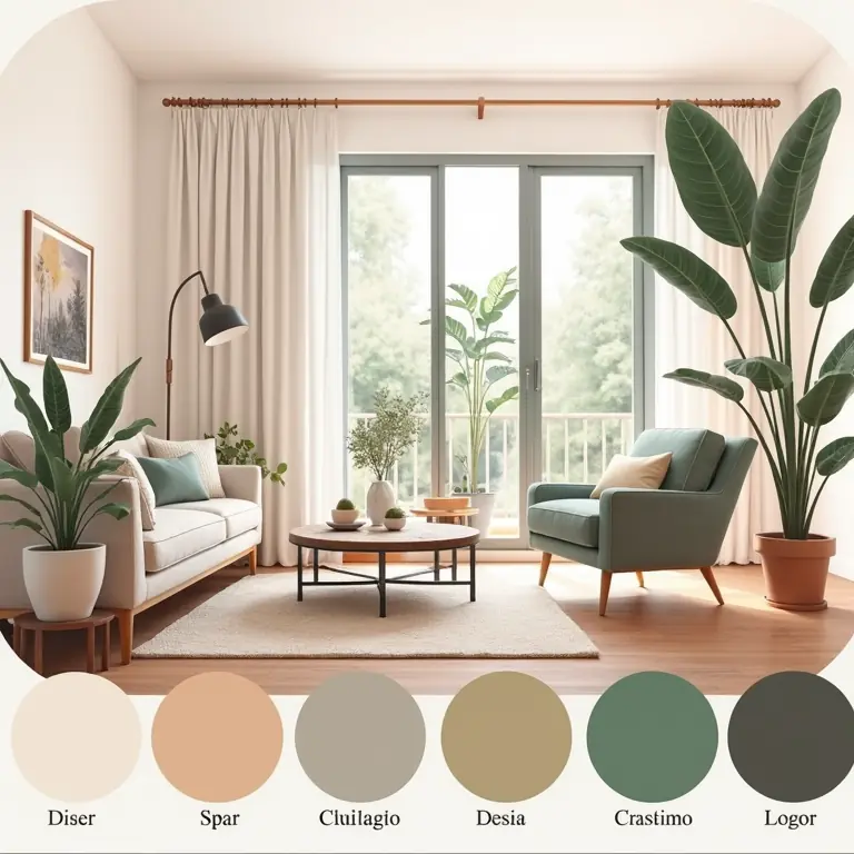
Popular Colour Schemes – Finding Your Perfect Match
Now that we’ve covered the basics, let’s explore some popular colour schemes. Each scheme offers a different aesthetic and mood. Remember, these are starting points – feel free to adapt them to your personal preferences!
Monochromatic
This scheme uses variations of a single hue. It’s sophisticated, calming, and easy to execute. The key is to play with different values and saturations of your chosen colour. For example, a monochromatic blue scheme might include pale sky blue, medium navy, and deep indigo. Texture becomes particularly important in monochromatic schemes to add visual interest.
Analogous
Analogous schemes use colours that are next to each other on the colour wheel. They create a harmonious and serene feel, often found in nature. For example, a scheme based on yellow might include yellow-green, yellow, and yellow-orange. One colour typically dominates, while the others are used for accents.
Complementary
Complementary colours are opposite each other on the colour wheel (e.g., red and green, blue and orange, yellow and purple). They offer high contrast and visual excitement. Using complementary colours can create a vibrant and energetic space, but it’s important to use them strategically. Often, it’s best to use one colour as the dominant hue and the other as an accent.
Triadic
Triadic schemes use three colours that are equally spaced on the colour wheel. This creates a balanced and lively scheme. For example, red, yellow, and blue. Again, balance is key – choose one colour to dominate and use the others for accents. This scheme works well in children’s rooms or creative spaces.
Tetradic (or Double Complementary)
This is the most complex scheme, using four colours arranged in two complementary pairs. It’s best used by experienced decorators as it can easily become overwhelming. A good approach is to choose one dominant colour and use the others as accents.
Considering Your Home’s Existing Features
Before you start painting, take stock of your home’s existing elements. These will influence your colour choices and ensure a cohesive look.
Fixed Elements
These are the elements that are difficult or expensive to change, such as flooring, countertops, cabinetry, and fireplaces. Your colour scheme should complement these features. If you have warm-toned wood floors, warm colours will generally blend better. Cool-toned tiles might pair well with cooler colours.
Architectural Style
The architectural style of your home can also guide your colour choices. Victorian homes often look beautiful with rich, jewel-toned colours, while modern homes tend to favour neutral palettes with pops of colour. Consider the historical context of your home.
Natural Light
The amount of natural light a room receives significantly impacts how colours appear. Rooms with plenty of natural light can handle darker, bolder colours. Rooms with limited light benefit from lighter, brighter colours to maximize the available illumination. Test paint samples in the room at different times of day to see how the colour changes with the light.
The Psychology of Colour: How Colours Affect Mood
Colours have a profound impact on our emotions and wellbeing. Understanding this can help you choose colours that create the desired atmosphere in each room.
- Red: Energetic, passionate, stimulating. Good for dining rooms or entryways, but can be overwhelming in bedrooms.
- Orange: Warm, inviting, cheerful. Good for kitchens, playrooms, or social spaces.
- Yellow: Optimistic, cheerful, energetic. Good for kitchens, bathrooms, or home offices.
- Green: Calming, refreshing, natural. Good for bedrooms, living rooms, or any space where you want to relax.
- Blue: Calming, serene, peaceful. Good for bedrooms, bathrooms, or home offices.
- Purple: Luxurious, creative, mysterious. Good for bedrooms, living rooms, or studies.
- Neutral Colours (White, Gray, Beige): Versatile, calming, sophisticated. Provide a blank canvas and can be paired with any accent colour.
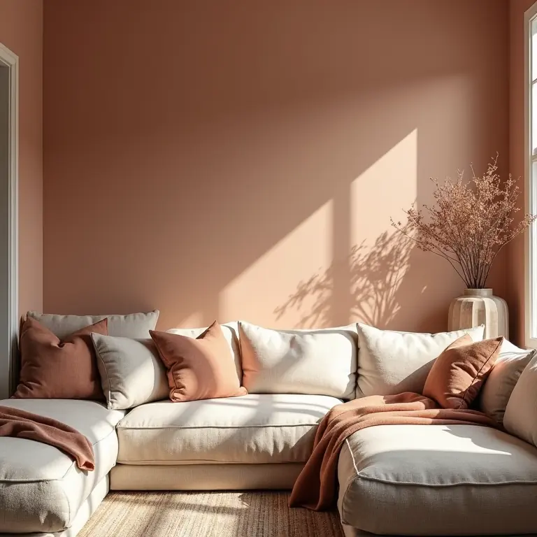
Practical Tips for Choosing Your Colour Scheme
Ready to put theory into practice? Here are some practical tips to help you confidently choose colours.
Start with Inspiration
Gather inspiration from magazines, websites (like Pinterest), or even nature. Create a mood board with images, fabrics, and paint swatches that appeal to you. This will help you identify your style and preferences.
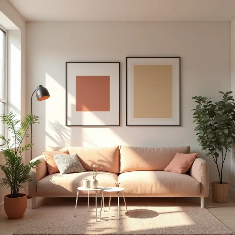
Limit Your Palette
Don’t try to use too many colours. A good rule of thumb is to choose a base colour, two accent colours, and a neutral. This will create a cohesive and balanced look.
The 60-30-10 Rule
This is a helpful guideline for balancing colours in a room:
- 60%: Dominant colour – used on walls, large furniture pieces.
- 30%: Secondary colour – used on upholstery, curtains, accent walls.
- 10%: Accent colour – used on pillows, accessories, artwork.
Test, Test, Test!
Never choose a paint colour based on a tiny swatch. Purchase sample pots and paint large swatches on your walls. Observe the colours at different times of day and in different lighting conditions. Live with the swatches for a few days before making a final decision.
Consider the Flow
Think about how the colours flow from one room to another. You don’t need to use the same colours throughout the entire house, but there should be a sense of continuity. Use a common thread – a similar hue or a shared neutral – to tie the spaces together.
Don’t Be Afraid to Experiment
Ultimately, the most important thing is to choose colours that you love! Don’t be afraid to try something new or unexpected. After all, it’s your home, and it should reflect your personality.
Resources for Further Exploration
Want to delve deeper into the world of colour? Here are some helpful resources:
- Adobe Color: https://color.adobe.com/ – A website for creating and exploring colour palettes.
- Sherwin-Williams ColourSnap Visualizer: https://www.sherwin-williams.com/en-us/visualizer – A tool for virtually painting your rooms.
And for a bit of creative inspiration, why not explore techniques for tapping into your imagination? Check out Decode Your Daydreams: A Friendly Guide to Creative Visualization. If you’re looking to unwind and find fulfilling activities, you might enjoy Decode Your Downtime: A Friendly Guide to Mindful Hobby Selection. And for those with a passion for the outdoors, Build a Better Bird Feeder Camera: A Friendly Guide to Wildlife Photography on a Budget offers a fun and rewarding project.
Creating a harmonious home colour scheme is a journey, not a destination. Be patient, trust your instincts, and most importantly, have fun! With a little knowledge and experimentation, you can transform your house into a beautiful and inviting space that reflects your unique style and enhances your wellbeing.
Discussion about this post